Showing posts with label design. Show all posts

Wednesday, July 09, 2008

The power of the Nudge

Here's an interesting article on the power of the 'nudge' from the Sunday Times.

Politicians are devouring a book called Nudge, written by two American academics, Richard Thaler and Cass Sunstein, which demonstrates how "thoughtful choice architecture can be established to nudge us in beneficial directions without restricting freedom of choice". That is, by knowing how people think, we can design 'choice environments' that make it easier for people to choose what is best for themselves, their families, and their society.

The article mentions one example of this type of 'choice environment' - an ingenious little gadget called the Wattson which displays the amount of electricity you are using through colours and numbers, thus encouraging users to reduce the amount they use.

As the article explains, 'Nudge' is also encouraging politicians to think creatively about the power of social norms to influence our behaviour. As well as reducing our electricity consumption, other examples of areas in which social norms might provide a 'nudge' include organ donation and rubbish disposal.

...Realising that financial incentives and penalties such as green taxes had a limited effect on behaviour, Schultz set out to analyse how the energy usage of 300 people in San Marcos, California, could be changed for the better by invoking social norms.

He arranged for the participants to be told on their energy bills what the typical usage in the area was.

"Telling people what others are doing does tend to have an effect," he said. "But there are instances where it can boomerang – if you are using less energy than your neighbours, say by making a sacrifice by not running your air-conditioning, you can feel like a sucker." The result: your energy consumption goes up, not down, to meet the norm.

...Schultz’s solution was to add a little nudge. Some of the participants in his study had a smiley face added to their bill if they used less energy than the norm and a sad face if they used more. The results were startling. Among the participants receiving the emoticon, the boomerang effect completely disappeared. High users reduced their consumption by even more and low users kept their own down.

Disarmingly simple. So simple, in fact, that you wonder why no one's done it before!

Or, what about this "clever use of choice architecture [to] find a middle way for organ donation":

... "We quite like the idea of ‘mandated choice’ in this context," he said. This does not involve any presumption of opt-in or opt-out. Instead it requires people to make a deliberate choice by tacking the process onto something else, such as applying for a driver’s licence or a passport. That solves the problems of both our inertia and bias in the system.

You can see why the politicians are interested in this stuff. Something so simple is surely worth a try? But, as the article states, "it sounds too good to be true. Is it more wishful thinking than sensible policy? Can social norms really change our behaviour?"

Sunday, July 06, 2008

Surface Design Websites and Wall Decals

Check out the Print & Pattern blog - a website showcasing surface design of all kinds. There are some awesome prints on there.

Also, I just stumbled across Wall Decals - self-adhesive vinyl 'stickers' that you use to decorate walls etc (and can be repositioned). I bought some for a birthday present for someone recently without realising what they were (they're selling kiddie versions in B&Q). But there are some fab designs out there...


Urban Outfitters - trendy but sadly US-based


Supernice Blik Graphics - lots of cool designs here, but not cheap!


The Threadless designs are pretty groovy as well.
  

Friday, June 20, 2008

Wordle-ing

Whoever thought text analysis could be so fun! Wordle creates 'word clouds' from text you provide - and produces some surprisingly striking images in just a few seconds! Try it yourself to see...

Here's one or two I made earlier.. (well actually, just now!)


(from the -slightly edited- Wikipedia entry for Durham)


(from an old essay - can you guess what on?)


(from another old essay!)


(from a well-known song...)

It's a bit addictive really!

Here's one I didn't make:

(the complete text of the ESV Bible)
Isn't it interesting what words come up?

[Thanks to Matt!]

Monday, March 31, 2008

Design for the Other 90%

The title of this post comes from a recent design exhibition - with a difference. As the exhibition website explains,
Of the world’s total population of 6.5 billion, 5.8 billion people, or 90%, have little or no access to most of the products and services many of us take for granted; in fact, nearly half do not have regular access to food, clean water, or shelter. Design for the Other 90% explores a growing movement among designers to design low-cost solutions for this 'other 90%.' Through partnerships both local and global, individuals and organizations are finding unique ways to address the basic challenges of survival and progress faced by the world’s poor and marginalized.
There are some fantastic ideas being showcased here, both ingenious and simple. Other websites celebrating designs for the developing world include the INDEX award, the Project H Design site, and the blog TreeHugger, among others.

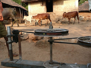
I've long been fascinated by the development of the One Laptop Per Child project, its 'first principles' approach and the way in which OLPC have turned every assumption about building laptops on its head. There's an excellent video of the designer Mary Lou Jepsen at the Greener Gadgets show explaining the many innovations that have gone into the XO laptop and why it's not only low-cost and fit-for-purpose, but also amazingly 'green' as well. In fact, as she explains, it could not have been otherwise: the design had to be low energy and 'green' in order to survive in an environment where energy is at a premium. There's a great section about innovative charging methods including (my favourite) the cow-charger! I completely get her excitement - so many elements of this design are worth raving about!


Of the many design solutions being profiled on these websites, some of my other favourites include the LifeStraw, a personal water-filtration and purification device, the weird but ingeneous Stenop Low-Cost Correcting Glasses, and the simple but effective Hippo Roller!


Classic ideas also seeing a new lease of life include the Solar Oven, the WaterCone, a solar-powered water desalinator, and the Portable Light Project, which makes use of the new high-brightness LEDs.

"The majority of the world’s designers focus all their efforts on developing products and services exclusively for the richest 10% of the world’s customers. Nothing less than a revolution in design is needed to reach the other 90%."
—Dr. Paul Polak, International Development Enterprises (link)

Another design site I've enjoyed recently is the Houses of the Future project - check out the cardboard house!

What 'Other 90%' or 'Green' design ideas have caught your eye recently?

Monday, September 11, 2006

Sunshine + water =

Everyone knows about rainbows, but have you heard of Sun Dogs and ice halos, moonbows and glories? Atmospheric Optics is a fascinating site, dedicated to the beautiful results of sunshine with water droplets or ice crystals.

The site has some amazing photographs, some simple, some almost unbelievable. And although the optics/mathematics here is very involved, the basic physics of refraction and dispersion is relatively simple. it's incredible to think that such basic ingredients could combine to produce such beautiful and complex displays.

Tuesday, April 04, 2006

10 beautiful things...

...to see in space!

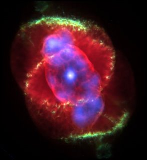
1. Cat's Eye Nebula


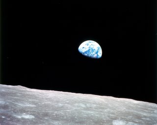
2. Earthrise (taken by Apollo 8) - from NASA Historical Images


3. Gas pillars in Eagle Nebula (M16)


4. Hubble Ultra Deep Field (HUDP)
This picture looks back in time 13 billion years and despite covering a tiny fraction of the sky (3 arc minutes square) includes 10,000 galaxies! Those points of light? They're not stars...


5. Horsehead Nebula
The dark area that makes up the head is a dark nebula - a thick cloud of hydrogen gas and dust where new stars are being formed. The nebula can be seen here only because it blocks out the light of the emission nebula behind it.


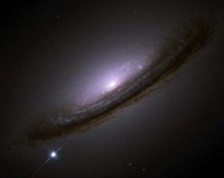
6. Supernova 1994D in Galaxy NGC 4526
Supernovae are massive explosions, often the dying moments of a massive star (although SN 199D is a type 1a supernova, caused by an explosion in a white dwarf star). They shine only briefly but for those few days may outshine the galaxy in which they reside! Supernovae are hugely important 'creation' events, as the force of the explosion forms many of the heavier elements, blasting them into space. (Fusion in stars forms elements up to iron on the Periodic Table, but heavier elements, e.g. copper, tin, silver, gold, are not formed by fusion.)


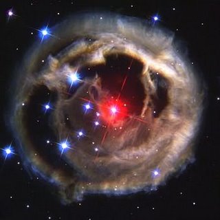
7. Light echo from Red Supergiant V838
This picture is one of a dramatic series of images taken by the Hubble telescope in early 2002 and showing a sudden brightening of star V838 Monocerotis, lighting up the dust clouds around it. It is called a light echo because the pictures show a ring of illumination gradually expanding around the star as the light travels outwards.


8. ...a picture I would love to take!
Images like this always stump the kids..even when they should know the answer!
I'm sure you'll figure it out straight away.. but can anyone work out the exposure time?


9. The Ring Nebula, in the constellation Lyra
This is one of the most famous Planetary Nebulae, the gas and dust drifting away from the white dwarf (seen in the centre of the image) left behind at the end of a star's life. This is an almost true-colour image, the colours are from the different elements glowing in the dust (blue - hot helium, green - ionized oxygen, red - ionized nitrogen).


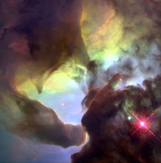
10. Twisters in the Lagoon Nebula
The Lagoon Nebula is one of only a few nebulae visible to the naked eye in the Northern Hemisphere and can be seen in the constellation of Sagittarius. Check out the larger picture and explanation.


(Note: all these pictures - except the star trails - are from NASA and therefore copyright-free)

Wednesday, March 29, 2006

Urville

Here's something odd, but kind of cool...

A Frenchman called Gilles Trehlin has spent years designing an imaginary city called Urville. His website contains descriptions of the geography, economy and society, but I particularly enjoyed his drawings of places and buildings.

I think these are my favourites:


Saturday, November 26, 2005

A non-trivial congruence - or the real beauty of Mathematics

Something I often find myself struggling to explain is the concept of mathematical beauty. It's something that mathematicians and physicists instinctively recognise, but it's not easy to articulate to the lay person!

But I was most heartened to find the following excerpt on John Polkinghorne's website (a wierd site set-up means it's impossible to link straight to the article). He doesn't answer the question of beauty per se but he makes a most appealing case for the amazingness of mathematics generally!

He's discussing aspects of metaphysics... 'aspects of the laws of physics which raise questions beyond physics' competence to answer':

"The first is a property of the physical world that is so familiar to us that we take it for granted. It is, in fact, the necessary basis of the whole scientific endeavor. It is this: that we can understand the world, that it is intelligible to us, that it is rationally transparent. Not only do we understand the world, but it is mathematics which is the key to the understanding of the physical universe. In fundamental physics one looks for theories which in their mathematical expression are economic and elegant, which are mathematically beautiful. Mathematical beauty is a very recognizable characteristic. There is an expectation -- an expectation that has been justified time and again in the history of physics -- that it is just those theories which have the character of mathematical economy and elegance which will prove to be the ones that explain what is going on in the physical world. If you have a friend who is a theoretical physicist, and you wish to upset them, you simply say to them, "That new theory of yours looks rather ugly and contrived to me." They will be truly upset, because you are saying that it does not have the character which successful theory always has had.

When we use mathematics in that way as a heuristic tool, a device for finding out what's going on in the world, something very odd is happening. After all, what is mathematics? Mathematics is the free exploration of the finite human mind. Our mathematical friends sit in their studies and out of their heads they spin the beautiful patterns of mathematics. Mathematics can be thought of as a pattern creating, pattern analyzing, subject. Yet some of the most beautiful patterns that are dreamt up by the pure mathematicians in their studies are found actually to occur in the structures of the physical world around us. In other words, there is a deep-seated congruence between the reason that we experience within (in our minds) and the reason that we experience without (in the physical world around us). They fit together like a glove. That seems a fact about the physical world that is what the mathematicians in their modest way would call non-trivial. 'Non-trivial' is a mathematical word meaning 'highly significant.'"


Wow wow wow (or is it just me?!) I love this guy!

Wednesday, November 09, 2005

Just the best bits?

Chris has highlighted some interesting websites on his web journal. Check out the Gospel Spectrum, which is not only an excellent use of flash technology as visualisation aid / teaching tool (the media here actually adding a new dimension rather than simply displaying), but also shows some really interesting results.

I was especially interested in the level of Gospel harmony during different periods of Jesus' ministry. A button in the bottom left hand corner allows you to limit the view to those stories which appear in all four Gospels (click '4'!)

The feeding of the five thousand appears in all four - perhaps because with so many people involved it was well reported?! The triumphant entry into Jerusalem is similarly well represented by all four, who tell very similar versions. Plenty of witnesses that day!

The most completely represented period of Jesus' life is of course the period of his trials and death. Interesting that Peter's denial is so well-told in all four (actually it has the largest total amount of verse-space!). That the story of the lowest moment in the life of the leader of the church in Jerusalem should figure so prominently in its Scriptures says something about the nature of that church, doesn't it? And surely something about Peter. The story is told in such detail - how did it become so 'public' without the assistance of Peter himself?

This reminds me of Paul talking about boasting in weakness that the power of God might be made known in us. Do we tell the shameful stories, or even 'own' them in ourselves, so that the grace and power of God will be seen more clearly? We're so adept at only telling the best bits..